Classification with Logistic Regression
Finally, more to the point of our research goal in this section we'll talk about how to use a logistic regression model to build a classifier which predicts whether an Instagram account is real (ie. y=1) or fake (ie. y=0).
What is a classifier?
There are many types of algorithms and models that can perform the same task, which yield potentially different (better) classifications of the same set of points.
In our case, there are simply just two categories real (ie. y=1) or fake (ie. y=0), but a classifier can actually assign observations to more than two categories.
Basic Classifier
For instance, we saw that there was a pretty strong association between the number_of_followers variable and our account_status variable below.
By just "eye-balling" a good cut-off threshold of 200 number_of_followers in the plot below, we could devise the following basic classifier model based on the following rule.
Rule
$
\hat{y} = \begin{cases}
1\ (real) & \text{if } number_of_followers\geq200, \
0\ (fake) & \text{if } number_of_followers<200
\end{cases}
$
sns.boxplot(x='number_of_followers', y='account_type', data=df_train)
plt.axvline(x=200, color='red', linestyle='--')
plt.title('Training Data')
plt.show()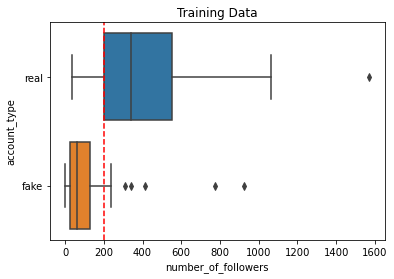
We can already tell that with this basic classifier that there will be at least some classification errors even in our training dataset. For instance, the fake account that we see above with 926 followers would be misclassified as real because it has at least 200 followers. Furthermore, the real account with just 35 followers would be misclassified as fake as it has less than 200 followers.
We can actually create a set of classifications $\hat{y}_{train}$ for our training dataset by creating a pandas series condition that stipulates the classifier rule for a classification of $\hat{y}=1$.
(df['number_of_followers']>=200)
(df['number_of_followers']>=200)0 True
1 False
2 True
4 True
5 True
...
115 False
116 False
117 True
118 True
119 False
Name: number_of_followers, Length: 105, dtype: bool
And then multiplying this condition by 1*. This converts all True values to a classification of $\hat{y}=1$ and all False values to a classification of $\hat{y}=0$.
1*(df['number_of_followers']>=200)0 1
1 0
2 1
4 1
5 1
..
115 0
116 0
117 1
118 1
119 0
Name: number_of_followers, Length: 105, dtype: int32
df_train['y_hat'] = 1*(df_train['number_of_followers']>=200)
df_train| has_a_profile_pic | number_of_words_in_name | num_characters_in_bio | number_of_posts | number_of_followers | number_of_follows | account_type | y | y_hat | |
|---|---|---|---|---|---|---|---|---|---|
| 47 | yes | 2 | 0 | 0 | 87 | 40 | real | 1 | 0 |
| 51 | yes | 2 | 81 | 25 | 341 | 274 | real | 1 | 1 |
| 75 | no | 1 | 0 | 1 | 24 | 2 | fake | 0 | 0 |
| 93 | yes | 0 | 0 | 15 | 772 | 3239 | fake | 0 | 1 |
| 76 | no | 2 | 0 | 0 | 13 | 22 | fake | 0 | 0 |
| ... | ... | ... | ... | ... | ... | ... | ... | ... | ... |
| 91 | yes | 1 | 0 | 0 | 119 | 350 | fake | 0 | 0 |
| 38 | yes | 1 | 0 | 14 | 264 | 151 | real | 1 | 1 |
| 63 | no | 1 | 0 | 0 | 69 | 694 | fake | 0 | 0 |
| 60 | no | 1 | 0 | 0 | 0 | 2 | fake | 0 | 0 |
| 7 | yes | 2 | 0 | 19 | 552 | 521 | real | 1 | 1 |
84 rows × 9 columns
We can see that 77% (65/84) of our training dataset accounts were correctly classified! Not too bad for a basic classifier!
(df_train['y_hat']==df_train['y']).sum()65
65/840.7738095238095238
Logistic Regression Classifier
Let's see if we can use a logistic regression model to come up with a classifier that will yield fewer misclassifications than the one above.
For initial visualization purposes, let's first go back to our simple logistic regression equation that we fitted.
$\hat{p}=\frac{1}{1+e^{-(-1.581+0.006number_of_followers)}}$
sns.regplot(x='number_of_followers', y='y',
            data=df_train, ci=False,
            logistic=True)
plt.show()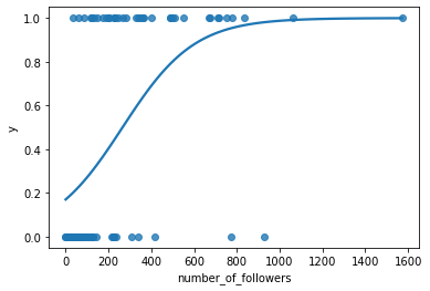
Given that our logistic regression model only predicts the probability $\hat{p}$ that a given observation has $Y=1$, we need to come up with a predictive probability threshold rule that will stipulate when a given observation should be classified with $\hat{y}=1$ and when it should be classified with $\hat{y}=0$. Given that 0.5 is halfway between 0 and 1, a predictive probability threshold of $\hat{p}_0=0.5$, might be a threshold to try first. So we now stipulate another classifier below.
Simple Logistic Regression Classifier with $\hat{p}_0=0.5$
$
\hat{y} = \begin{cases}
1\ (real) & \text{if } \hat{p}\geq0.5; \
0\ (fake) & \text{if } \hat{p}<0.5
\end{cases}
$
Let's classify our training dataset with this new threshold.
First we create the set of predictive probabilities for each of our training dataset observations.
pred_prob_train = log_mod.predict(df_train)
df_train['predictive_prob'] = pred_prob_train
pred_prob_train
47 0.256773
51 0.610670
75 0.191845
93 0.953352
76 0.181891
...
91 0.294796
38 0.497871
63 0.236850
60 0.170651
7 0.846439
Length: 84, dtype: float64
And then we classify each of these predictive probabilities according to our rule stipulated above.
df_train['y_hat'] = 1*(df_train['predictive_prob']>=0.5)
df_train[['y', 'y_hat', 'predictive_prob']].head()| y | y_hat | predictive_prob | |
|---|---|---|---|
| 47 | 1 | 0 | 0.256773 |
| 51 | 1 | 1 | 0.610670 |
| 75 | 0 | 0 | 0.191845 |
| 93 | 0 | 1 | 0.953352 |
| 76 | 0 | 0 | 0.181891 |
#Curve plotting data
num_followers=np.arange(0,1600,10)
p=1/(1+np.exp(-(-1.581+0.006*num_followers)))

#Data color coded by classification
sns.scatterplot(x='number_of_followers', y='y', hue='y_hat',
            data=df_train)

#Logistic regression curve
plt.plot(num_followers, p, color='black', label='Logistic Regression Curve')

#Predictive probability threshold
plt.hlines(y=0.5, color='red',
           xmin=0, xmax=1600,
           label='Predictive probability Threshold')

#Equivalent number of followers threshold
plt.axvline(x=263.5, color='green',
           label='Equivalent Number of Followers Threshold')

plt.title('Training Data')
plt.legend(bbox_to_anchor=(1,1))
plt.show()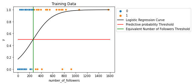
If we color code our training dataset by their classifications made with the predictive probability threshold of $\hat{p}=0.5$ (red line), we can see that there naturally exists an equivalent number_of_followers threshold that creates this same classification.
To figure out what this equivalent number_of_followersthreshold is, we can solve our predictive probability threshold inequality below for number_of_followers.
\begin{alignat*}{2}
\hat{p} = \frac{1}{1 + e^{-(-1.581 + 0.006 \cdot \text{number of followers})}} &\geq 0.5 \
-1.581 + 0.006 \cdot \text{number of followers} &\geq \log\left(\frac{0.5}{1-0.5}\right) & \
\text{number of followers} &\geq 263.5 &
\end
This number of followers threshold of 263.5 is not too far off from what we "eye-balled" in our basic classifier. Let's see if we got better results with this more informed classifier model.
num_follower_threshold = (np.log(0.5/(1-0.5))+1.581)/.006
num_follower_threshold
263.5
Types of Misclassifications and Correct Classifications
But first, we can see in our training dataset below that this more informed classifier still had some misclassifications. We'll first label the two ways that any classifier can misclassify and the two ways in which any classifier can correctly classify a given set of observations.
#Curve plotting data
num_followers=np.arange(0,1600,10)
p=1/(1+np.exp(-(-1.581+0.006*num_followers)))

#Data color coded by classification
sns.scatterplot(x='number_of_followers', y='y', hue='y_hat',
            data=df_train)

#Logistic regression curve
plt.plot(num_followers, p, color='black', label='Logistic Regression Curve')

#Predictive probability threshold
plt.hlines(y=0.5, color='red',
           xmin=0, xmax=1600,
           label='Predictive probability Threshold')


plt.title('Training Data')
plt.legend(bbox_to_anchor=(1,1))
plt.show()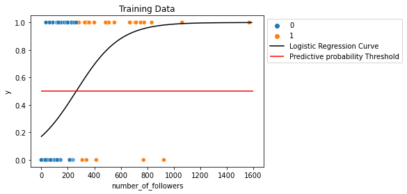
Predictions Made by a Classifier
-
We say that an observation is a predictive positive for a given threshold in a classifier if $\hat{y}=1$.
-
We say that an observation is a predictive negative for a given threshold in a classifier if $\hat{y}=0$.
Types of Predictive Positives
- We call classified observation a true positive if the observation predicted to be positive (ie. $\hat{y}=1$) and it is actually positive (ie. $y=1$). Thus the classifier has correctly classified this observation.
- We call classified observation a false positive if the observation predicted to be positive (ie. $\hat{y}=1$) and it is actually negative (ie. $y=0$). Thus the classifier has incorrectly classified this observation.
Types of Predictive Negative
- We call classified observation a true negative if the observation predicted to be negative (ie. $\hat{y}=10$) and it is actually negative (ie. $y=0$). Thus the classifier has correctly classified this observation.
- We call classified observation a false negative if the observation predicted to be negative (ie. $\hat{y}=0$) and it is actually positive (ie. $y=1$). Thus the classifier has incorrectly classified this observation.
Confusion Matrix
We calculate and display the number of each of these four types of classifications for a given dataset and classifier in what we call a confusion matrix.
| Predicted Negative (0) | Predicted Positive (1) | |
| Actual Negative (0) | True Negative = 42 | False Positive = 5 |
| Actual Positive (1) | False Negative = 16 | True Positive = 21 |
We can use the confustion_matrix() function to quickly create this confusion matrix for us using:
- y_true the array of actual target array values
- y_pred the array of predicted target array values from the classifier.
from sklearn.metrics import confusion_matrix
confusion_matrix(y_true=df_train['y'], y_pred=df_train['y_hat'])
array([[42, 5],
[16, 21]], dtype=int64)
We can use the .ravel() to quickly extract these 4 classification counts.
tn, fp, fn, tp =confusion_matrix(y_true=df_train['y'], y_pred=df_train['y_hat']).ravel()
(tn, fp, fn, tp)
(42, 5, 16, 21)
What this tells us is the following about our training dataset classifications.
- True Negatives (TN): 42 fake accounts ($y=0$) were correctly predicted to be fake ($\hat{y}=0$)
- False Positives (FP): 5 fake accounts ($y=0$) were incorrectly predicted to be real ($\hat{y}=1$)
- False Negatives (FN): 16 real accounts ($y=1$) were incorrectly predicted to be fake ($\hat{y}=0$)
- True Positives (TP): 21 real accounts ($y=1$) were correctly predicted to be real ($\hat{y}=1$)
Different Types of Accuracy Rates
Accuracy and Error Rates
Naturally, an ideal classifier would have an overall accuracy rate of 100% and an overall misclassification (ie. error) rate of 0% for the given dataset that you are classifying. However, this is often an unrealistic classifier outcome for many datasets.
If we breakdown our classified dataset into one of the four classification categories that we defined above, then we can actually calculate the overall classification accuracy rate as follows.
$accuracy = \frac{num\ of\ correct\ classifications}{total\ observations}=\frac{TN+TP}{TN+TP+FN+FP}$
Sophisticated Models not Always Better!
Interestingly enough, the accuracy rate (75%) of our logistic regression classifier that used a predictive probability threshold of $\hat{p}_0=0.5$ was a little bit lower than the accuracy rate (77%) of our basic classifier that we created via "eye-balling" in 10.1!
accuracy = (tn+tp)/(tn+tp+fn+fp)
accuracy
0.75
error = 1-accuracy
error
0.25
In 10.5 we'll explore modifying our predictive probability probability threshold $\hat{p}_0$ that we use with our logistic regression model to try to achieve better results. But what this shows us is a very important lesson: the more sophisticated model does not always achieve better results!
Explainability
In fact, if you can build a model that both achieves better results AND is easier to explain both to data scientists and non-technical audiences (what we call explainability), then the model that you built is very desirable indeed! Being able to explain your model design and results to the general public helps build public trust in your research results and in the data science community overall.
Accuracy for Actual Positives vs. Actual Negatives
But if a classifier model has an overall classification accuracy that is higher than another model, does this necessarily mean that it is the most desirable? For instance, consider the following two scenarios for why someone might desire a fake Instagram classifier.
-
Scenario 1: Suppose you are a data scientist that works at Instagram. You would like to detect and eliminate fake accounts from the platform. It's not a big deal if some fake accounts are not detected and deleted. But you are concerned that the company will suffer a "public relations" setback if too many real accounts are deleted.
-
Scenario 2: You are Taylor Swift and you'd like to give away free concert tickets to a somewhat random sample of your Instagram followers. Upon announcement, you suspect that ticket resellers have created a large amount of fake accounts and followed you to maximize their chances of getting a ticket. Thus, you want to be highly certain that accounts that you select are real people. But if you misidentify a few unlucky real accounts as fake, it's not as big of a deal.
In scenario 1, ideally you'd like for the classification of the actual positives (ie. the actual real accounts) to be as accurate as possible, while the accuracy rate of the actual negatives (ie. the actual fake accounts) does not have to be as good.
Alternatively, in scenario 2, ideally you'd like for the classification of the actual negatives (ie. the actual fake accounts) to be as accurate as possible, while the accuracy rate of the actual positives (ie. the actual real accounts) does not have to be as good.
Sensitivity and Specificity
We generally use the terms sensitivity and specificity to measure how well a given classifier is classifying actual positive observations and actual negtive observations in a given dataset respectively.
Sensitivity Rate (True Positive Rate)
The sensitivity rate, also known as the true positive rate (TPR) of a given classifier model is the percent of observations in the dataset that are actually a positive (ie. y=1) that are correctly predicted to be a positive (ie. $\hat{y}=1$).
\begin{align*}
\text{Sensitivity Rate} &= \frac{\text{True Positives}}{\text{True Positives} + \text{False Negatives}} \
&= \frac{\text{True Positives}}{\text{Total Observations that are Actually Positive}}
\end
Ideally, we'd like for the sensitivity (tpr) to be 1.
The sensitivity of our logistic regression classifier (with $\hat{p}_0=0.5$) is 0.57, which is only a small amount over 50%. Thus, the classifier does not perform very well when it comes to classifying real accounts (ie. positives).
If this classifier was used on this dataset, 43% (=1-.57) of real accounts would get labeled as fake and deleted! Thus, the Instagram data scientist in scenario #1 above would definitely not prefer to use this classifier!
sensitivity = tp/(tp+fn)
sensitivity
0.5675675675675675
Specificity Rate (True Negative Rate)
The specificity rate, also known as the true negative rate (TNR) of a given classifier model is the percent of observations in the dataset that are actually a negative (ie. y=0) that are correctly predicted to be a negative (ie. $\hat{y}=0$).
\begin{align*}
\text{Specificity Rate} &= \frac{\text{True Negatives}}{\text{True Negatives} + \text{False Positives}} \
&= \frac{\text{True Negatives}}{\text{Total Observations that are Actually Negatives}}
\end
Ideally, we'd like for the specificity (tnr) to be 1.
The specificity of our logistic regression classifier (with $\hat{p}_0=0.5$) is 0.89, which is somewhat close to 1. Thus, the classifier performs pretty well when it comes to classifying fake accounts (ie. negatives). Thus, Taylor Swift in scenario #2 above might prefer this classifier, but it'd be great to get this rate even higher!
specificity = tn/(tn+fp)
specificity
0.8936170212765957
False Positive Rate (1-Specificity Rate)
Another type of classifier accuracy metric that is commonly used is the false positive rate. The false positive rate (FPR) of a given classifier model is the percent of observations in the dataset that are actually negative (ie. y=0) that are incorrectly predicted to be a positive (ie. $\hat{y}=1$).
\begin{align*}
\text{False Positive Rate} &= \frac{\text{False Positives}}{\text{True Negatives} + \text{False Positives}} \
&= \frac{\text{False Positives}}{\text{Total Observations that are Actually Negative}}
\end
Ideally, we'd like for the false positive rate to be 0.
Also notice how FPR and specificity relate to eachother.
\begin{align*}
\text{False Positive Rate (FPR)} &= \frac{\text{False Positives}}{\text{True Negatives} + \text{False Positives}} \
&= 1 - \left( \frac{\text{True Negatives}}{\text{True Negatives} + \text{False Negatives}} \right) \
&= 1 - \text{Specificity Rate}
\end
We can see that about fpr=11% of fake accounts (ie. negatives) are incorrectly classified as real (ie. positive).
fnr = 1- specificity
fnr
0.1063829787234043
Different Predictive Probability Thresholds
Just considering overall accuracy, we saw that our logistic regression classifier with $\hat{p}_0=0.5$ did not perform as well as our basic classifier that we created via "eye-balling" in 10.1.
By changing $\hat{p}_0$ in our logistic regression classifier, we can achieve different:
- accuracy rates
- sensitivity rates
- specificity rates.
We'll actually see that sensitivity and specificity of the classifications of a given dataset are related to each other as we modify this threshold. Let's explore this relationship.
Increasing Predictive Probability Thresholds
First, let's explore what happens to our classifications as we aise our predictive probability threshold from $\hat{p}_0=0.5$ to $\hat{p}_0=0.8$.
Or in other words, we'll compare the results of two classifiers.
Simple Logistic Regression Classifier with $\hat{p}_0=0.5$
$
\hat{y} = \begin{cases}
1\ (real) & \text{if } \hat{p}\geq0.5 \
0\ (fake) & \text{if } \hat{p}<0.5
\end{cases}
$
Simple Logistic Regression Classifier with $\hat{p}_0=0.8$
$
\hat{y} = \begin{cases}
1\ (real) & \text{if } \hat{p}\geq0.8 \
0\ (fake) & \text{if } \hat{p}<0.8
\end{cases}
$
We'll classify our training dataset with these two classifiers in the code below.
df_train['y_hat'] = 1*(df_train['predictive_prob']>=0.5)
df_train['y_hat'] = 1*(df_train['predictive_prob']>=0.8)
#Creating old threshold (0.5) classifications
df_train['y_hat'] = 1*(df_train['predictive_prob']>=0.5)
#Plotting classifications
sns.scatterplot(x='number_of_followers', y='y', hue='y_hat', data=df_train)
plt.plot(num_followers, p, color='black', label='Logistic Regression Curve')
plt.hlines(y=0.5, color='red', xmin=0, xmax=1600, label='Predictive probability Threshold (0.5)')
plt.title('Old Threshold (0.5) Classifications')
plt.legend(bbox_to_anchor=(1,1))
plt.show()
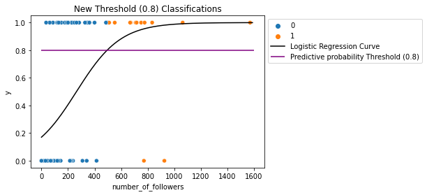
#Creating new threshold (0.8) classifications
df_train['y_hat'] = 1*(df_train['predictive_prob']>=0.8)
#Plotting classifications
sns.scatterplot(x='number_of_followers', y='y', hue='y_hat', data=df_train)
plt.plot(num_followers, p, color='black', label='Logistic Regression Curve')
plt.hlines(y=0.8, color='purple', xmin=0, xmax=1600, label='Predictive probability Threshold (0.8)')
plt.title('New Threshold (0.8) Classifications')
plt.legend(bbox_to_anchor=(1,1))
plt.show()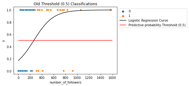
What happened here?
We can see that when we raised the threshold $\hat{p}_0$, the number of:
- true positives (top right orange points) decreased (unideal)
- true negatives (bottom left blue points) increased (ideal).
Because the number of actual positives ($y=1$ values) and the number of of actual negatives ($y=0$ values) stayed the same, then this means that:
- $Sensitivity=\frac{True\ Positives}{Actual\ Positives}$ decreased (unideal).
- $Specificity=\frac{True\ Negatives}{Actual\ Negatives}$ increased (ideal).
df_train['y_hat'] = 1*(df_train['predictive_prob']>=0.8)
tn, fp, fn, tp =confusion_matrix(y_true=df_train['y'], y_pred=df_train['y_hat']).ravel()
sensitivity = tp/(tp+fn)
specificity = tn/(tn+fp)
accuracy = (tn+tp)/(tn+tp+fn+fp)
print('Sensitivity (TPR):', sensitivity)
print('Specificity (TNR):', specificity)
print('Accuracy:', accuracy)
Sensitivity (TPR): 0.2972972972972973
Specificity (TNR): 0.9574468085106383
Accuracy: 0.6666666666666666
Better Specificity for Taylor Swift!
For instance, the specificity rate got even higher using this higher threshold of $\hat{p}_0=0.8$. Taylor Swift, who desires higher accuracy when it comes to classifying fake accounts (ie. negatives) would desire this classifier even more than the last one!
Lower Overall Accuracy
Notice that the overall accuracy of this classifier for this dataset is the lowest that we've seen so far. Only 66% of accounts in the training dataset will be accurately classified. Is this a big deal? It depends on who plans to use the classifier! So far this is the best classifier for Taylor Swift.
Decreasing Predictive Probability Thresholds
Next, let's explore what happens to our classifications as we lower our predictive probability threshold from $\hat{p}_0=0.5$ to $\hat{p}_0=0.3$.
So now, we'll compare the results of two classifiers.
Simple Logistic Regression Classifier with $\hat{p}_0=0.5$
$
\hat{y} = \begin{cases}
1\ (real) & \text{if } \hat{p}\geq0.5 \
0\ (fake) & \text{if } \hat{p}<0.5
\end{cases}
$
Simple Logistic Regression Classifier with $\hat{p}_0=0.3$
$
\hat{y} = \begin{cases}
1\ (real) & \text{if } \hat{p}\geq0.3 \
0\ (fake) & \text{if } \hat{p}<0.3
\end{cases}
$
We'll classify our training dataset with these two classifiers in the code below.
df_train['y_hat'] = 1*(df_train['predictive_prob']>=0.5)
df_train['y_hat'] = 1*(df_train['predictive_prob']>=0.3)
#Creating old threshold (0.5) classifications
df_train['y_hat'] = 1*(df_train['predictive_prob']>=0.5)

#Plotting classifications
sns.scatterplot(x='number_of_followers', y='y', hue='y_hat', data=df_train)
plt.plot(num_followers, p, color='black', label='Logistic Regression Curve')
plt.hlines(y=0.5, color='red', xmin=0, xmax=1600, label='Predictive probability Threshold (0.5)')
plt.title('Old Threshold (0.5) Classifications')
plt.legend(bbox_to_anchor=(1,1))
plt.show()

#Creating new threshold (0.8) classifications
df_train['y_hat'] = 1*(df_train['predictive_prob']>=0.3)

#Plotting classifications
sns.scatterplot(x='number_of_followers', y='y', hue='y_hat', data=df_train)
plt.plot(num_followers, p, color='black', label='Logistic Regression Curve')
plt.hlines(y=0.3, color='purple', xmin=0, xmax=1600, label='Predictive probability Threshold (0.3)')
plt.title('New Threshold (0.3) Classifications')
plt.legend(bbox_to_anchor=(1,1))
plt.show()

What happened here?
We can see that when we lowered the threshold $\hat{p}_0$, the number of:
- true positives (top right orange points) increased (ideal)
- true negatives (bottom left blue points) decreased (unideal).
Because the number of actual positives ($y=1$ values) and the number of of actual negatives ($y=0$ values) stayed the same, then this means that:
- $Sensitivity=\frac{True\ Positives}{Actual\ Positives}$ increased (ideal).
- $Specificity=\frac{True\ Negatives}{Actual\ Negatives}$ decreased (unideal).
df_train['y_hat'] = 1*(df_train['predictive_prob']>=0.3)
tn, fp, fn, tp =confusion_matrix(y_true=df_train['y'], y_pred=df_train['y_hat']).ravel()
sensitivity = tp/(tp+fn)
specificity = tn/(tn+fp)
accuracy = (tn+tp)/(tn+tp+fn+fp)
print('Sensitivity (TPR):', sensitivity)
print('Specificity (TNR):', specificity)
print('Accuracy:', accuracy)
Sensitivity (TPR): 0.8648648648648649
Specificity (TNR): 0.723404255319149
Accuracy: 0.7857142857142857
Better Sensitivity for the Instagram Data Scientist!
For instance, the sensitivity rate dramatically increased using this lower threshold of $\hat{p}_0=0.3$. The Instagram data scientist in scenario #1, who desires higher accuracy when it comes to classifying real accounts (ie. positives) would desire this classifier even more than the last two that we've looked at!
Best Overall Accuracy
Notice that the overall accuracy of this classifier for this dataset is the best that we've seen so far. Only 78.6% of accounts in the training dataset will be accurately classified. Does that mean that we should select this classifier as the best? Again, it depends on who plans to use the classifier
Relationship between Threshold, Specificity, and Sensitivity
What we showed here is the principle of that there is "no free lunch" when it comes to classification. When the sensitivity (tpr) increases, the specificity (tnr) decreases, and vice versa, when we change the predictive probability threshold.
Let's summarize this relationship here.
- When $\hat{p}_0$ increases, sensitivity (tpr) decreases and specificity (tnr) increases.
- When $\hat{p}_0$ decreases, sensitivity (tpr) increases and specificity (tnr) decreases.
Selecting a Good Predictive Probability Threshold
Now that we've built more of an intuitive sense as to how the tpr and the tnr = 1-fpr change as we increase the predictive probability threshold, let's see if we can use our full logistic regression model with all six explanatory variables to build an even better classifier.
$
\hat{p} = \frac{1}{1 + \exp\left(-\begin{aligned}
&-37.47 \
&+ 30.73(,\text{has a profile pic}[T.yes]) \
&+ 2.60(,\text{number of words in name}) \
&+ 0.087(,\text{num characters in bio}) \
&- 0.0060(,\text{number of posts}) \
&+ 0.025(,\text{number of followers}) \
&- 0.0046(,\text{number of follows})
\end{aligned}\right)}
$
With this logistic regression model in mind, our next question is: which of the many predictive probability thresholds that we could use between 0 and 1 best help us meet our research goals? What options do we have?
TPR vs. FPR Relationship
To help us determine, we'll introduce what we call a Receiver Operating Characteristic Curve (ROC curve) in 10.7.2. This curve plots the relationship between the tpr and the fpr of a series of classifications made with different predictive probability thresholds for a given dataset and a given model (like our logistic regression model).
In 10.6.3, we discussed how as sensitivity (tpr) increases, specificity (tnr) decreases, and vice versa. Similarly, because $fpr=1-tnr$ we have the following relationship.
- When $\hat{p}_0$ increases, TPR decreases (ideal) and FPR decreases (unideal).
- When $\hat{p}_0$ decreases, TPR increases (ideal) and FPR increases (unideal).
Creating a ROC Curve
To help us select which classifier model is best (out of all possible predictive probability thresholds $\hat{p}_0$ that we could use), we plot what we call a Receiver Operating Characteristic curve (ROC curve) for a given given dataset and a given model (like our logistic regression model).
We create these plots by doing the following.
Steps
- Select many, many values of the predictive probability thresholds $\hat{p}_0$ starting from 0 and going to 1.
- Then, for each of these values of $\hat{p}_0$, calculate the fpr and the tpr of the classifier model with the given dataset.
- Then plot each of these (fpr,tpr) values as (x,y) coordinates in a plot and connect the points to form a line plot.
The roc_curve() function helps us create an ROC curve. On the backend, it comes up with many, many predictive probability thresholds between 0 and 1. With each of these thresholds, it classifies the supplied dataset and calculates the (fpr, tpr) for each of the classifications created.
Full Logistic Regression Model ROC Curve - Training Data
For instance, let's create an ROC curve for the full logistic regression model and the training dataset.
First, let's our full logistic regression model to predict the set of predictive probabilities that correspond to each of the training dataset observations using the .predict() function.
df_train['predictive_prob'] = log_mod_full.predict(df_train)
df_train[['predictive_prob','y']].head()| predictive_prob | y | |
|---|---|---|
| 47 | 6.135607e-01 | 1 |
| 51 | 9.999969e-01 | 1 |
| 75 | 1.296927e-15 | 0 |
| 93 | 7.890994e-02 | 0 |
| 76 | 1.211548e-14 | 0 |
Next we supply the roc_curve() function with:
- y_true: the set of actual response variable values in the training dataset
- y_score: the set of predictive probabilities the model predicts for each of the observations in the training dataset
from sklearn.metrics import roc_curve
fprs, tprs, thresholds = roc_curve(y_true=df_train['y'],
                            y_score=df_train['predictive_prob'])
The resulting fprs and tprs are shown below.
pd.DataFrame({'fpr': fprs, 'tpr': tprs})| fpr | tpr | |
|---|---|---|
| 0 | 0.000000 | 0.000000 |
| 1 | 0.000000 | 0.027027 |
| 2 | 0.000000 | 0.594595 |
| 3 | 0.021277 | 0.594595 |
| 4 | 0.021277 | 0.945946 |
| 5 | 0.063830 | 0.945946 |
| 6 | 0.063830 | 1.000000 |
| 7 | 0.276596 | 1.000000 |
| 8 | 0.319149 | 1.000000 |
| 9 | 0.893617 | 1.000000 |
| 10 | 0.936170 | 1.000000 |
| 11 | 1.000000 | 1.000000 |
We'll also use the roc_auc_score() function which takes the same inputs
- y_true: the set of actual response variable values in the training dataset
- y_score: the set of predictive probabilities the model predicts for each of the observations in the training dataset.
We'll explain what the resulting auc value means in section 10.7.4.
from sklearn.metrics import roc_auc_score
auc = roc_auc_score(y_true=df_train['y'],
                            y_score=df_train['predictive_prob'])
auc
0.9890741805635422
Finally, to create the roc curve that corresponds to this full logistic regression model and the training dataset we can use this function that we define below.
def plot_roc(fpr, tpr, auc, lw=2):
    plt.plot(fpr, tpr, color='darkorange', lw=lw,
             label='ROC curve (area = '+str(round(auc,3))+')')
    plt.plot([0, 1], [0, 1], color='navy', lw=lw, linestyle='--')
    plt.xlabel('False Positive Rate')
    plt.ylabel('True Positive Rate')
    plt.title('ROC Curve')
    plt.legend(loc="lower right")
    plt.show()
We'll use the fprs, tprs, and auc values that we created above as our inputs for this function.
plot_roc(fprs, tprs, auc)
ROC Curve Properties
There are some key properties that we can observe in our ROC curve shown above that will actually hold for any ROC curve.
- ROC curves will always have the point (fpr,tpr)=(0,0). If we make our $p_0$ low enough, we will always get classification results with these values.
- ROC curves will always have the point (fpr,tpr)=(1,1). If we make our $p_0$ high enough, we will always get classification results with these values.
- ROC curves will never decrease (as you move from left to right).
Selecting the Best Predictive Probability Threshold
One thing that we can use our ROC curve for is to help us visually examine all of the possible (fpr, tpr) classification options available to us using this model and this dataset.
Luckily, our ROC curve above actually get pretty close to this ideal (fpr, tpr) combination of (0,1) for the training dataset. The two (fpr,tpr) points that get pretty close to (0,1) look like classifications that we might want to inspect further. To figure out what predictive probability thresholds give us these two (fpr, tpr) points, we can cycle through a series of classifications that are created via a series of predictive probability thresholds that we select.
To make this easier, let's define this function below that will:
- classify an array of predictive probabilities
pred_prob, - using a given predictive probability threshold
thresh, - and calculate the corresponding fpr and tpr of the classification, using the given actual response variable values
y.
def fpr_tpr_thresh(y, pred_prob, thresh):
    yhat = 1*(pred_prob >= thresh)
    tn, fp, fn, tp = confusion_matrix(y_true=y, y_pred=yhat).ravel()
    tpr = tp / (fn + tp)
    fpr = fp / (fp + tn)
    return pd.DataFrame({'threshold':[thresh],
                         'fpr':[fpr],
                         'tpr':[tpr]})
For instance, the (fpr,tpr)=(0.022, 0.946) for the training dataset when using the full logistic regression model and a predictive probability threshold of $\hat{p}_0=0.5$.
fpr_tpr_thresh(df_train['y'], df_train['predictive_prob'], 0.5)| threshold | fpr | tpr | |
|---|---|---|---|
| 0 | 0.5 | 0.021277 | 0.945946 |
Let's use this function trying out the following predictive probability thresholds: $\hat{p}_0=0, 0.01, 0.02,..., 1$.
for thresh in np.arange(0,1.01,.01):
    print(fpr_tpr_thresh(df_train['y'], df_train['predictive_prob'], thresh))
threshold fpr tpr
0 0.0 1.0 1.0
threshold fpr tpr
0 0.01 0.425532 1.0
threshold fpr tpr
0 0.02 0.361702 1.0
threshold fpr tpr
0 0.03 0.319149 1.0
threshold fpr tpr
0 0.04 0.276596 1.0
threshold fpr tpr
0 0.05 0.255319 1.0
threshold fpr tpr
0 0.06 0.212766 1.0
threshold fpr tpr
0 0.07 0.191489 1.0
threshold fpr tpr
0 0.08 0.148936 1.0
threshold fpr tpr
0 0.09 0.12766 1.0
threshold fpr tpr
0 0.1 0.106383 1.0
threshold fpr tpr
0 0.11 0.085106 1.0
threshold fpr tpr
0 0.12 0.085106 1.0
threshold fpr tpr
0 0.13 0.085106 1.0
threshold fpr tpr
0 0.14 0.085106 1.0
threshold fpr tpr
0 0.15 0.085106 1.0
threshold fpr tpr
0 0.16 0.085106 1.0
threshold fpr tpr
0 0.17 0.085106 1.0
threshold fpr tpr
0 0.18 0.085106 1.0
threshold fpr tpr
0 0.19 0.06383 1.0
threshold fpr tpr
0 0.2 0.06383 1.0
threshold fpr tpr
0 0.21 0.06383 1.0
threshold fpr tpr
0 0.22 0.06383 1.0
threshold fpr tpr
0 0.23 0.06383 1.0
threshold fpr tpr
0 0.24 0.06383 1.0
threshold fpr tpr
0 0.25 0.06383 1.0
threshold fpr tpr
0 0.26 0.06383 1.0
threshold fpr tpr
0 0.27 0.06383 1.0
threshold fpr tpr
0 0.28 0.06383 0.972973
threshold fpr tpr
0 0.29 0.06383 0.972973
threshold fpr tpr
0 0.3 0.06383 0.972973
threshold fpr tpr
0 0.31 0.06383 0.972973
threshold fpr tpr
0 0.32 0.06383 0.972973
threshold fpr tpr
0 0.33 0.06383 0.972973
threshold fpr tpr
0 0.34 0.06383 0.945946
threshold fpr tpr
0 0.35 0.06383 0.945946
threshold fpr tpr
0 0.36 0.06383 0.945946
threshold fpr tpr
0 0.37 0.042553 0.945946
threshold fpr tpr
0 0.38 0.042553 0.945946
threshold fpr tpr
0 0.39 0.042553 0.945946
threshold fpr tpr
0 0.4 0.042553 0.945946
threshold fpr tpr
0 0.41 0.042553 0.945946
threshold fpr tpr
0 0.42 0.042553 0.945946
threshold fpr tpr
0 0.43 0.042553 0.945946
threshold fpr tpr
0 0.44 0.042553 0.945946
threshold fpr tpr
0 0.45 0.042553 0.945946
threshold fpr tpr
0 0.46 0.042553 0.945946
threshold fpr tpr
0 0.47 0.042553 0.945946
threshold fpr tpr
0 0.48 0.021277 0.945946
threshold fpr tpr
0 0.49 0.021277 0.945946
threshold fpr tpr
0 0.5 0.021277 0.945946
threshold fpr tpr
0 0.51 0.021277 0.945946
threshold fpr tpr
0 0.52 0.021277 0.945946
threshold fpr tpr
0 0.53 0.021277 0.945946
threshold fpr tpr
0 0.54 0.021277 0.945946
threshold fpr tpr
0 0.55 0.021277 0.945946
threshold fpr tpr
0 0.56 0.021277 0.945946
threshold fpr tpr
0 0.57 0.021277 0.945946
threshold fpr tpr
0 0.58 0.021277 0.945946
threshold fpr tpr
0 0.59 0.021277 0.918919
threshold fpr tpr
0 0.6 0.021277 0.918919
threshold fpr tpr
0 0.61 0.021277 0.918919
threshold fpr tpr
0 0.62 0.021277 0.891892
threshold fpr tpr
0 0.63 0.021277 0.891892
threshold fpr tpr
0 0.64 0.021277 0.891892
threshold fpr tpr
0 0.65 0.021277 0.891892
threshold fpr tpr
0 0.66 0.021277 0.891892
threshold fpr tpr
0 0.67 0.021277 0.891892
threshold fpr tpr
0 0.68 0.021277 0.891892
threshold fpr tpr
0 0.69 0.021277 0.891892
threshold fpr tpr
0 0.7 0.021277 0.891892
threshold fpr tpr
0 0.71 0.021277 0.891892
threshold fpr tpr
0 0.72 0.021277 0.891892
threshold fpr tpr
0 0.73 0.021277 0.891892
threshold fpr tpr
0 0.74 0.021277 0.891892
threshold fpr tpr
0 0.75 0.021277 0.891892
threshold fpr tpr
0 0.76 0.021277 0.891892
threshold fpr tpr
0 0.77 0.021277 0.891892
threshold fpr tpr
0 0.78 0.021277 0.891892
threshold fpr tpr
0 0.79 0.021277 0.891892
threshold fpr tpr
0 0.8 0.021277 0.891892
threshold fpr tpr
0 0.81 0.021277 0.891892
threshold fpr tpr
0 0.82 0.021277 0.891892
threshold fpr tpr
0 0.83 0.021277 0.891892
threshold fpr tpr
0 0.84 0.021277 0.891892
threshold fpr tpr
0 0.85 0.021277 0.864865
threshold fpr tpr
0 0.86 0.021277 0.864865
threshold fpr tpr
0 0.87 0.021277 0.864865
threshold fpr tpr
0 0.88 0.021277 0.864865
threshold fpr tpr
0 0.89 0.021277 0.864865
threshold fpr tpr
0 0.9 0.021277 0.864865
threshold fpr tpr
0 0.91 0.021277 0.837838
threshold fpr tpr
0 0.92 0.021277 0.810811
threshold fpr tpr
0 0.93 0.021277 0.810811
threshold fpr tpr
0 0.94 0.021277 0.783784
threshold fpr tpr
0 0.95 0.021277 0.756757
threshold fpr tpr
0 0.96 0.021277 0.702703
threshold fpr tpr
0 0.97 0.021277 0.675676
threshold fpr tpr
0 0.98 0.021277 0.594595
threshold fpr tpr
0 0.99 0.0 0.594595
threshold fpr tpr
0 1.0 0.0 0.0
What might the Instagram Data Scientist Choose?
It looks like with thresholds $0\leq \hat{p}_0\leq 0.27$ we can attain a training dataset classification with perfect tpr (1) and almost perfect fpr (0.067). This would be the ideal classification for the Instagram data scientist, who wants a high tpr (ie. no real accounts deleted) and ideally would like for the fpr to be low as well as a secondary goal (ie. lots of fake accounts deleted).
fpr_tpr_thresh(df_train['y'], df_train['predictive_prob'], 0.27)| threshold | fpr | tpr | |
|---|---|---|---|
| 0 | 0.27 | 0.06383 | 1.0 |
What might Taylor Swift Choose?
On the other hand, it looks like that in order to get a fpr that is PERFECT, this would involve large sacrifices with respect to tpr. The best tpr that corresponds to a perfect fpr of 0 is unfortunately quite low at 0.59. This is achieved with $\hat{p}_0=0.99$.
fpr_tpr_thresh(df_train['y'], df_train['predictive_prob'], 0.99)| threshold | fpr | tpr | |
|---|---|---|---|
| 0 | 0.99 | 0.0 | 0.594595 |
Ideally, Taylor would like for the fpr to be as low as possible (no fakers classified as real and potentially getting a ticket), but would she be comfortable with only 59% of her real Instagram fans having the chance to get a free ticket? Perhaps not.
On the other hand, with $\hat{p}_0=0.48$, if she's comfortable with only as little as 2.1% of fake accounts being classifed as real ($fpr=0.021$), then she can achieve as many as 94.6% of real accounts correctly identified as real ($tpr=0.946$) and thus have the chance to win a ticket.
fpr_tpr_thresh(df_train['y'], df_train['predictive_prob'], 0.48)| threshold | fpr | tpr | |
|---|---|---|---|
| 0 | 0.48 | 0.021277 | 0.945946 |
Evaluating the Logistic Regression Model with Respect to ALL Classifications
Another way that we can use the ROC curve generated by a given model for a given dataset is to evaluate how well it did with respect to all possible classifications that it could have been created using all predictive probability thresholds between 0 and 1.
How might we qualitatively evaluate this?
One of the most common ways to evaluate this is to see how close the ROC curve got to having a predictive probability threshold that created the ideal classification of $(fpr,tpr)=(0,1)$.
We can see in our ROC curve below that we indeed got pretty close to this ideal point of $(fpr,tpr)=(0,1)$.
plot_roc(fprs, tprs, auc)
AUC: How might we quantitatively evaluate this?
Now let's think about how we might quantify how close the ROC curve got to having this ideal classification of $(fpr,tpr)=(0,1)$. To do this we calculate the area under the curve (AUC). Specifically, this corresponds the area under the ROC curve between $0\leq fpr\leq 1$.
Ideal AUC
If an ROC curve happened to have the point $(fpr,tpr)=(0,1)$, then the ROC curve would look like this curve below. The area under this curve would be equal to 1.
#Ideal ROC curve
plot_roc([0,0,1], [0,1,1], 1)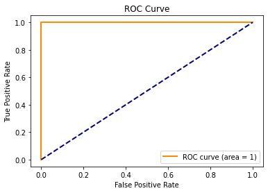
"Worst Case Scenario" AUC
Now let's think about the worst possible ROC curve we could theoretically observe for a given model and dataset. Theoretically, we could have a model and dataset that produces an ROC curve that looks like the one below. Notice how one of the classifications $(fpr,tpr)=(1,0)$, produces the "worst of both worlds". The fpr is the worst it could possibly be AND the tpr is the worst it could possibly be. Notice how the area under this curve would be 0.
#Worst ROC curve
plot_roc([0,1,1], [0,0,1], 0)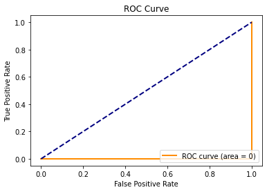
This might be the kind of ROC curve that we would observe with a poorly fit logistic regression curve and dataset like that shown below.
#Example dataset
df_temp = pd.DataFrame({'x':[-3,-2,-1,1,2,3], 'y':[0,0,0,1,1,1]})
sns.scatterplot(x='x', y='y', data=df_temp)

#Example logistic regression curve
x = np.linspace(-3, 3, 10)
p = 1 / (1 + np.exp(-(0.5-2*x)))

plt.plot(x,p, color='green', label='Bad Fit Logistic Regression')
plt.title('Horribly Fit Logistic Regression Model')
plt.show()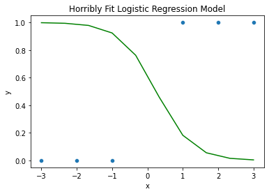
Take note, however that this curve above is not actually the best fit logistic regression curve for this dataset. The best fit logistic regression curve, would be horizontally flipped about the y-axis at the very least.
We had to work very hard (or perhaps make a mistake) to contrive this "bad fitting model". Generally, most ROC curves will not have an AUC that is below 0.5.
"REALISTIC Worst Case Scenario" AUC
Given how practically difficult it is to create a model for a given dataset that produces an ROC curve with an $AUC=0$ or an AUC that is close to 0, let's think about what kind of model for a given dataset might produce a realistic "worst case scenario" ROC curve.
You might be wondering what the blue dashed line in each of our ROC curves represents at this point. What this represents is the ROC curve that we would expect to see if we were to create a model that randomly guesses whether each observation in the dataset is a positive ($\hat{y}=1$) or negative ($\hat{y}=0$). The area under this curve would be 0.5.
Thus, if you have produced a model for a given dataset that has an $AUC\leq0.5$, then this is a sign that your model is a very poor fit for the purposes of classification. You would have been better off just making random guesses for the classifications in this dataset!
#REALISTIC Worst ROC curve
plot_roc([0,1], [0,1], 0.5)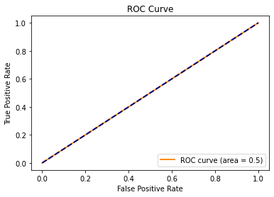
Model Selection using the AUC
Finally, let's return to our main overarching research goal. Ideally, we'd like to select the best classifier for predicting fake and real Instagram accounts for new datasets.
Full Model Training Data ROC Curve
We've already seen that our full logistic regression model (trained with the training dataset) produces a training dataset ROC curve with an almost perfect AUC of 0.989.
Full Logistic Regression Model
$
\hat{p} = \frac{1}{1 + \exp\left(-\begin{aligned}
&-37.47 \
&+ 30.73(,\text{has a profile pic}[T.yes]) \
&+ 2.60(,\text{number of words in name}) \
&+ 0.087(,\text{num characters in bio}) \
&- 0.0060(,\text{number of posts}) \
&+ 0.025(,\text{number of followers}) \
&- 0.0046(,\text{number of follows})
\end{aligned}\right)}
$
#Full model TRAINING DATA predictive probabilities
df_train['predictive_prob'] = log_mod_full.predict(df_train)

#Full model TRAINING DATA ROC Curve
fprs, tprs, thresholds = roc_curve(y_true=df_train['y'],
                            y_score=df_train['predictive_prob'])
auc = roc_auc_score(y_true=df_train['y'],
                            y_score=df_train['predictive_prob'])
plot_roc(fprs, tprs, auc)
Full Model Test Data ROC Curve
But does this nearly perfect training data ROC curve and AUC found with the full model indicate that we would expect the full model to produce an ROC curve and AUC for a new dataset that is just as good?
Probably not! Just like we discussed in our linear regression modules, because the training dataset was actually used in the selection of our best fit intercept and slopes in the logistic regression model, the logistic regression model is likely to provide a better fit of the training dataset than some other dataset.
Thus, in order to get more of a realistic sense as to how well our full logistic regression model might perform when classifying new datasets, we should instead evaluate the full model ROC curve and AUC for the test dataset.
#Full model TEST DATA predictive probabilities
df_test['predictive_prob'] = log_mod_full.predict(df_test)

#Full model TEST DATA ROC Curve
fprs, tprs, thresholds = roc_curve(y_true=df_test['y'],
                            y_score=df_test['predictive_prob'])
auc = roc_auc_score(y_true=df_test['y'],
                            y_score=df_test['predictive_prob'])
plot_roc(fprs, tprs, auc)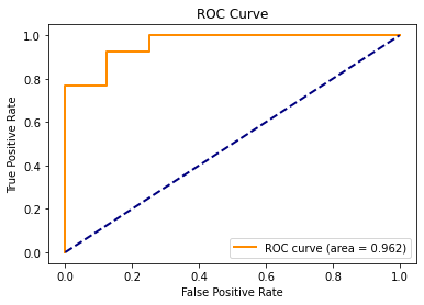
By creating this test data ROC curve with the full logistic regression model above, we do in fact see that the ROC curve is not as good as it was for the training data.
- The curve does not get as close to the ideal classification scenario of $(fpr,tpr)=(0,1)$ and
- The AUC of the ROC curve is slightly lower at 0.962.
However, a test data AUC of 0.962 is still very close to 1. This indicates that even the test dataset has some predictive probability threshold that will yield a classification that is pretty close to the ideal scenario of $(fpr,tpr)=(0,1)$.
Overfitting a Classifier
Just like in a linear regression model, including too many explanatory variables in a logistic regession model that do not bring enough unique predictive power to the overall model can lead the logistic regression model to overfit to the training dataset.
While the inclusion of these overfitting explanatory variables most likely will lead to better training dataset predictions. An overfit model can lead to worse test dataset predictions.
In module 11 we will discuss more sophisticated feature selection techniques that can be used to modify the set of potential explanatory variables to reduce the chance of overfitting. However, in 10.9.4 we will use ROC curves and AUC scores to simply just evaluate how just three candidate logistic regression models might perform when it comes to classifying Instagram accounts in new datasets.
Evaluating Three Candidate Models
In 2.2.2 we saw the number_of_follows explanatory variable had the weakest relationship with our account_type response variable.
sns.boxplot(x='number_of_follows', y='account_type', data=df)
plt.show()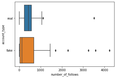
Alterntively, in 9.2.5 we saw that removing number_of_posts from the full model created the smallest reduction in the pseudo R^2 value.
print('Full Model Pseudo R^2:',log_mod_full.prsquared)Full Model Pseudo R^2: 0.819789878245675
mod_no_number_of_posts = smf.logit(formula='y~has_a_profile_pic+number_of_words_in_name+num_characters_in_bio+number_of_followers+number_of_follows', data=df_train).fit(disp=False)
print('Removing number_of_posts Pseudo R^2:',mod_no_number_of_posts.prsquared)
Removing number_of_posts Pseudo R^2: 0.8185143541316554
Thus if we only plan on evaluating a few logistic regression models, these two insights might give us some suggestions about two candidate models to test. These insights might suggest that number_of_follows or number_of_posts bring less predictive power to the logistic regression model, and thus could be leading to overfitting.
With this in mind, let's compare the test dataset ROC curves and AUC scores created with the following three logistic regression models (each trained with the training dataset).
Full Logistic Regression model
Predicts account_type with:
has_a_profile_picnumber_of_words_in_namenum_characters_in_bionumber_of_postsnumber_of_followersnumber_of_follows
#Refitting the full model with the training data
log_mod_full = smf.logit(formula='y~has_a_profile_pic+number_of_words_in_name+num_characters_in_bio+number_of_posts+number_of_followers+number_of_follows', data=df_train).fit()

#Full test data predictive probabilities
df_test['predictive_prob'] = log_mod_full.predict(df_test)

#Full model TEST DATA ROC Curve
fprs, tprs, thresholds = roc_curve(y_true=df_test['y'],
                            y_score=df_test['predictive_prob'])
auc = roc_auc_score(y_true=df_test['y'],
                            y_score=df_test['predictive_prob'])
plot_roc(fprs, tprs, auc)
Warning: Maximum number of iterations has been exceeded.
Current function value: 0.123632
Iterations: 35

Reduced Model 1
Predicts account_type with:
has_a_profile_picnumber_of_words_in_namenum_characters_in_bionumber_of_postsnumber_of_followersnumber_of_follows
#Fitting the REDUCED MODEL 1 with the training data
log_mod_red1 = smf.logit(formula='y~has_a_profile_pic+number_of_words_in_name+num_characters_in_bio+number_of_posts+number_of_followers', data=df_train).fit()

#REDUCED MODEL 1 test data predictive probabilities
df_test['predictive_prob'] = log_mod_red1.predict(df_test)

#REDUCED MODEL 1 test data ROC Curve
fprs, tprs, thresholds = roc_curve(y_true=df_test['y'],
                            y_score=df_test['predictive_prob'])
auc = roc_auc_score(y_true=df_test['y'],
                            y_score=df_test['predictive_prob'])
plot_roc(fprs, tprs, auc)
Warning: Maximum number of iterations has been exceeded.
Current function value: 0.182295
Iterations: 35
Reduced Model 2
Predicts account_type with:
has_a_profile_picnumber_of_words_in_namenum_characters_in_bionumber_of_postsnumber_of_followersnumber_of_follows
#Refitting the REDUCED MODEL 2 with the training data
log_mod_red2 = smf.logit(formula='y~has_a_profile_pic+number_of_words_in_name+num_characters_in_bio+number_of_followers+number_of_follows', data=df_train).fit()

#REDUCED MODEL 2 test data predictive probabilities
df_test['predictive_prob'] = log_mod_red2.predict(df_test)

#REDUCED MODEL 2 test data ROC Curve
fprs, tprs, thresholds = roc_curve(y_true=df_test['y'],
                            y_score=df_test['predictive_prob'])
auc = roc_auc_score(y_true=df_test['y'],
                            y_score=df_test['predictive_prob'])
plot_roc(fprs, tprs, auc)
Warning: Maximum number of iterations has been exceeded.
Current function value: 0.124507
Iterations: 35
Evaluation
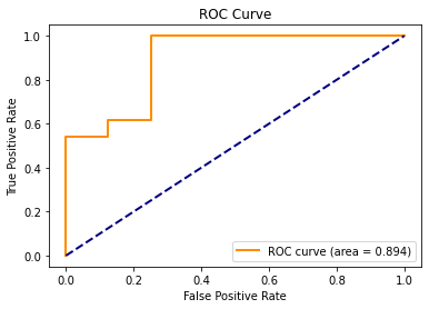
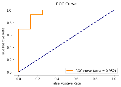
Of the three logistic regression models that we tested, the full model still produced the test data ROC curve with the best AUC score of 0.962.
The reduced model 1 which removed number_of_follows dramatically decreased the test data AUC to 0.894, while the reduced model 2 which removed number_of_posts only slightly decreased the test data AUc to 0.952.
Thus, if we are only relying on the suggestions of just a single training and test dataset, what this might suggest is the following.
- The
number_of_followsandnumber_of_postsexplanatory variables bring enough unique predictive power to the resulting classifier models created from the respective logistic regression models, and thus their inclusion does not lead to overfitting. - In the presence of the other remaining 5 explanatory variables,
number_of_followsbrings more predictive power to the classifiers created from the respective logistic regression models.
Current Analysis Drawbacks
Just Three Models Considered
As of right now, we have only evaluated three of the possible $2^6=64$ logistic regression models that we could create be either including or excluding our 6 possible explanatory variables. Thus it's possible that there exists a candidate logistic regression model that will yield an even higher test data AUC score. In section 11 we'll discuss feature selection techniques similar to what we've seen in Module 10 that can help us effeciently evaluate logistic regression models in an attempt to help us find the model that optimizes some metric of our choosing.
Interaction Terms
Furthermore, we have not considered the presence of any interaction terms on our test data AUC scores. We'll discuss in ??? how to include interaction terms in a logistic regression model and how to evaluate whether they may be needed.
Just a Single Training and Test Data Used
As we discussed in Module 9, if we only use a single training and test dataset to pick out the best model, the model that we select may vary based on the particular random seed that we used to created the training and test datasets. Cross-validation techniques which try out multiple pairs of training and test datasets can help manage some of the varyings decisions you might make due to this randomness of a single training and test dataset. We will also discuss this in section 11.
New Train Test Split for Learning Purposes
For learning purposes to showcase that the train test split method can yield sometimes yield different analyses, suggestions, and decisions all based on the particular random seed, let's create a new training and test dataset based on a different random seed. We'll use this new training and test dataset in our section 11 analyses.
#New training and test datasets
df_train, df_test = train_test_split(df, test_size=0.2, random_state=17)

#Recreate the y variable
df_train['y'] = df_train['account_type'].replace({'real':1, 'fake':0})
df_test['y'] = df_test['account_type'].replace({'real':1, 'fake':0})